Description:
Explore the rich tapestry of the New York Rangers logo history, from its foundational design in the 1920s to the subtle evolutions and iconic alternate marks that have defined one of hockey’s most enduring visual identities. This article delves into the New York Rangers logo meaning, uncovering the symbolism behind the classic shield and the beloved “Lady Liberty,” offering a comprehensive look at an emblem synonymous with New York City and Original Six hockey.
A Storied Shield: The New York Rangers Logo History and Enduring Legacy
The New York Rangers, one of the National Hockey League’s “Original Six” franchises, boast a history as rich and vibrant as the city they represent. Central to their identity, and instantly recognizable to hockey fans worldwide, is their iconic logo. More than just a design, the Rangers’ emblem is a symbol of tradition, resilience, and the spirit of New York City. This exploration delves into the fascinating New York Rangers logo history, tracing its evolution, and deciphering the profound New York Rangers logo meaning that has captivated generations. For those keen on understanding the New York Rangers logo evolution, this journey will highlight the subtle yet significant changes that have kept the brand both timeless and relevant.
The Genesis: Forging an Identity in the Roaring Twenties – Early New York Rangers Logo History
The story of the New York Rangers begins in 1926, when Madison Square Garden president George Lewis “Tex” Rickard was awarded an NHL franchise. The team’s nickname, “Rangers,” was a clever play on Rickard’s name – they were “Tex’s Rangers.” This moniker, born from a bit of wordplay, would soon be associated with one of hockey’s most storied franchises.
In their inaugural 1926-1927 season, the team didn’t have a formal crest on their jerseys in the way we understand modern logos. Instead, their jerseys featured the word “RANGERS” stitched diagonally across the chest in blue capital letters, often with red trim, on a cream or white background. This simple, typographic approach was common for sports teams of that era. While not a “logo” in the complex visual sense, this wordmark was the first visual representation of the team on the ice, laying the groundwork for the New York Rangers logo history.
The true iconic mark, the shield, would make its debut shortly thereafter, cementing a visual identity that has remained remarkably consistent for nearly a century.
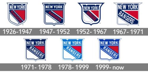
The Birth of the Shield (1927-Present): An Enduring Symbol in New York Rangers Logo History
The 1927-1928 season saw the introduction of the fundamental design that defines the New York Rangers logo history: the shield. This heraldic shape immediately conveyed a sense of strength, tradition, and honor. The design was strikingly effective and has, with minor variations, been the team’s primary logo ever since.
Key Elements and Their Meaning:
-
The Shield Shape: A classic, Heater-style shield. In heraldry, shields represent defense, protection, and by extension, strength and resilience. For a sports team, particularly one in a physically demanding game like hockey, the shield is a powerful symbol of the team’s competitive spirit and its role in “defending” its home ice and city’s honor.
-
“NEW YORK” Arch: Across the top of the shield, the words “NEW YORK” are arched, proudly proclaiming the team’s home. This element firmly roots the team in one of the world’s most iconic cities, making the New York Rangers logo meaning intrinsically tied to the Big Apple.
-
“RANGERS” Diagonal Banner: The team name, “RANGERS,” is emblazoned diagonally across the center of the shield, typically from the upper left to the lower right. This dynamic placement adds a sense of action and movement to the otherwise stately shield.
-
Color Palette (Red, White, and Blue): The consistent use of patriotic red, white, and blue is no accident. These colors, shared with the American flag, evoke a strong sense of national pride and connect the team deeply with its American identity.
-
Blue: Often represents loyalty, stability, and confidence.
-
Red: Symbolizes passion, energy, and determination.
-
White: Signifies purity, integrity, and often serves as a contrasting element to make the other colors pop.
-
This combination of elements created a logo that was not only aesthetically pleasing but also rich in symbolism, establishing a core visual identity that would stand the test of time. The initial iteration was relatively clean, with straightforward block lettering.
Subtle Shifts and Refinements: The Nuances of New York Rangers Logo Evolution
While the core shield design has remained remarkably stable, a hallmark of strong branding, the New York Rangers logo evolution is characterized by subtle refinements rather than radical overhauls. These changes often reflected evolving printing technologies, aesthetic trends of the time, or minor branding updates.
-
Font Tweaks: Throughout the decades, the serifs and thickness of the “NEW YORK” and “RANGERS” lettering have seen minor adjustments. Some eras featured slightly thinner lettering, others bolder. The specific style of the serifs (the small strokes at the ends of letters) has also varied.
-
Color Shade Variations: The precise shades of red and blue have occasionally shifted. Sometimes a brighter, more vibrant royal blue was used, while other times a deeper navy blue was preferred. Similarly, the red has ranged from a brighter crimson to a deeper, more traditional red.
-
Outline and Detail Emphasis: The thickness of the shield’s outline and the lines separating color fields have also seen minor changes.
-
The Introduction and Evolution of the Drop Shadow: One of the more noticeable, yet still subtle, changes in the New York Rangers logo evolution was the introduction of a drop shadow.
-
Mid-Century Modernization (c. 1950s-1970s): A darker blue, almost navy, became prominent. Around the late 1940s and into the 50s, a subtle drop shadow effect began to appear, giving the lettering and the shield a more three-dimensional look. This was a popular design trend of the era, adding depth and visual interest.
-
Streamlining (c. 1978-1990s): For a period, particularly from the late 1970s through the 1980s and into the early 90s, the logo often appeared slightly more streamlined, sometimes with a less pronounced or even absent drop shadow, and a slightly brighter, more “electric” blue, especially on merchandise and print materials. The on-ice jerseys maintained a more traditional look.
-
Return to Classic Depth (Late 1990s-Present): In more recent decades, the logo has generally featured a well-defined drop shadow, typically in a darker blue or black, reinforcing the three-dimensional quality of the shield and lettering. This modern iteration feels both classic and robust.
-
These subtle shifts demonstrate an understanding that a strong logo doesn’t need constant reinvention. Instead, gentle polishing ensures it remains contemporary without sacrificing its invaluable heritage. The core New York Rangers logo meaning – strength, tradition, and New York identity – has always been preserved.
The “Lady Liberty” Alternate Logo: A Modern Icon in New York Rangers Logo History (1996-2007, 2020-Present)
Perhaps the most significant development in the New York Rangers logo history outside of the primary shield was the introduction of the “Lady Liberty” alternate logo. Debuting in the 1996-97 season as part of the NHL’s third jersey program, this logo was an instant hit with fans.
-
Design: The logo features a stylized, forward-facing depiction of the Statue of Liberty’s head and crown, rendered in Rangers blue with silver and red accents. Below the iconic head, the letters “NYR” (New York Rangers) are prominently displayed in a bold, somewhat blocky font.
-
Meaning: The Lady Liberty logo directly and powerfully connects the team to New York City. The Statue of Liberty is arguably the most universally recognized symbol of New York and America, representing freedom, hope, and the city’s welcoming spirit. By adopting this imagery, the Rangers further solidified their identity as New York’s hockey team. It was a bold, modern statement that resonated deeply.
-
Popularity and Revival: The original Lady Liberty jerseys were incredibly popular but were retired in 2007. However, due to overwhelming fan demand, a revamped version of the Lady Liberty concept was brought back as part of the NHL’s “Reverse Retro” program in the 2020-21 season and has since made appearances as an official alternate. This return underscored its status as a beloved piece of the New York Rangers logo evolution and its significant place in the team’s visual branding.
The Lady Liberty logo serves as a perfect example of how a team can introduce a successful alternate mark that complements, rather than competes with, its primary identity. It broadened the New York Rangers logo meaning to explicitly include one of the city’s most cherished landmarks.
Special Edition and Anniversary Logos
Throughout their New York Rangers logo history, the team has also utilized various special edition logos for significant anniversaries and outdoor game appearances:
-
Anniversary Patches: For milestones like their 75th (2000-01) and 90th (2016-17) anniversaries, the Rangers introduced special commemorative patches, often incorporating elements of the primary shield with anniversary dates or unique design flourishes. These patches celebrate the team’s longevity and rich history.
-
Winter Classic & Stadium Series: For NHL Winter Classic appearances (e.g., 2012 vs. Flyers, 2018 vs. Sabres) and Stadium Series games, the Rangers have often worn throwback-inspired jerseys with vintage or modified versions of their logos. These frequently draw from earlier, simpler iterations of the shield or typographic elements, further exploring the depths of the New York Rangers logo evolution. For instance, the 2012 Winter Classic logo was a more rounded, vintage-style shield, while the 2018 Winter Classic featured “RANGERS” in a straight line with “NY” stylized above it, reminiscent of very early concepts.
These special event logos allow the team to celebrate specific moments and play with their visual heritage without altering the core brand.
The Enduring Appeal: Why the New York Rangers Logo Works
The primary New York Rangers shield has remained largely unchanged for nearly a century, a testament to its exceptional design. Several factors contribute to its lasting appeal and the strength of the New York Rangers logo meaning:
-
Timelessness: The shield is a classic heraldic device that doesn’t feel tied to any specific design fad. Its traditional form ensures it remains distinguished and relevant.
-
Simplicity and Boldness: The design is clean, uncluttered, and easily recognizable, even from a distance or at small sizes. The bold lettering and clear color separation make it impactful.
-
Strong Connection to Place: The prominent “NEW YORK” and patriotic colors firmly associate the team with its city and country.
-
Symbolic Resonance: The shield inherently conveys strength, protection, and honor, aligning perfectly with the competitive nature of hockey.
-
Tradition and Heritage: As one of the Original Six, the Rangers’ logo carries the weight of nearly a century of hockey history. It’s a symbol not just of a team, but of an era and a legacy. Fans connect with this history on a deep emotional level.
Compared to many sports teams that undergo frequent and drastic logo changes, the Rangers’ commitment to their core identity speaks volumes about the power of their original design.
Conclusion: The Unwavering Identity of the New York Rangers Logo History and Meaning
The journey through the New York Rangers logo history reveals a narrative of remarkable consistency punctuated by thoughtful evolution. From the simple diagonal “RANGERS” of their inaugural season to the enduring shield that quickly followed, the visual identity of the team has been a beacon of tradition and strength. The subtle refinements to the shield over the decades, and the celebrated introduction of the Lady Liberty alternate, showcase a brand that respects its heritage while embracing opportunities to connect with fans in new ways.
Ultimately, the New York Rangers logo meaning is multifaceted: it represents the team’s deep roots in New York City, its patriotic spirit, its resilience on the ice, and the unwavering loyalty of its fanbase. The shield is more than just a logo; it’s a badge of honor, a symbol of nearly a century of hockey played at the highest level in one of the world’s greatest cities. The enduring power of the New York Rangers logo history ensures that this iconic emblem will continue to inspire and unite fans for generations to come, a timeless mark in the ever-evolving world of sports branding.


